Product filter
I proposed implementing a product filter to address user confusion between fixed and custom-designed calendars in the Easy2C product catalogue. This solution aimed to enhance product clarity and streamline the browsing experience.
UX/UI Design (2025)

Audit
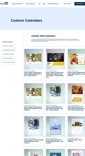
The personalised calendar page displays a range of customisable products, with the layout loosely organised by product type. While the left-hand panel lists product categories, it functions more as a navigation menu rather than a true filter. Each product title includes terms like "Fixed," "Flexi," or "Semi Flexi" to indicate the level of customisation, but this language was not immediately clear to users.
Hovering over a product reveals an enquiry overlay, but there’s no dynamic way to explore or compare products, making it difficult for users to evaluate their options effectively.
Original Website
Pain Points Identified:
-
Lack of clear filtering options: Users couldn't filter by format, size, or customisation level, making it difficult to narrow down choices.
-
Overwhelming layout: Displaying all products on a single page without categorisation cause difficulty in narrowing down options.
-
Repetitive content: Product titles were long and visually similar, and several products used identical images, making it hard to differentiate between options.
-
Terminology confusion: Users were unclear about the difference between "Fixed," "Flexi," and "Semi Flexi" offerings.
-
Limited interactivity: While hovering over a product reveals an enquiry overlay, users lack intuitive tools to explore product details or compare options.
Proposed Solution:
To improve navigation and product clarity, I proposed implementing a filtering system that would allow users to sort by customisation level and compare options more easily. The goal was to streamline the browsing experience, reduce visual clutter, and help users find the right calendar more efficiently.

To address this solution, I designed and implemented two prominent visual filtration buttons: Fixed Design and Custom Design. Positioned at the top of the product listing, these buttons use metaphorical icons and brief descriptions to clarify the distinction between using a pre-set template and opting for a fully custom calendar design. This immediately orients users and sets expectations for what each product type offers.
Product catalogue redesigned
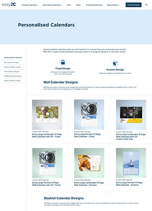
Fixed Design

Custom Design

Clicking either button automatically filters the product range, reducing the overwhelming list to only what's relevant to the user.

Hovering over a product reveals a preview of the customisable calendar, allowing users to compare options without navigating away from the page.
Reflection
This was a quickly made concept from idea to prototype in the span of 3 days. The primary goal was to help the team visualise how filtering buttons could clarify the types of custom products available. If I had more time, I would expand on the filtering system by adding format (portrait/landscape) and product size. The wording of the products also plays a huge part in the design, it opens more future opportunities for testing which terminology is more effective. As a result of this proposal, the website has since undergone iterations aimed at improving product clarity.